Work / Signage & Environmental
Modern Woodmen Field
A ballpark that had carried the same name since 1983 was getting a new one. Our job was to make the new name feel like it had always belonged to the building.
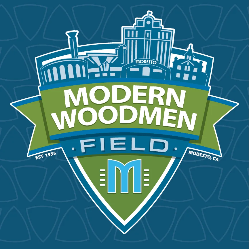
A 75-year-old ballpark was getting a new name
Modesto's professional baseball stadium opened in 1955 as Del Webb Field and became John Thurman Field in 1983, named for the assemblyman. Generations of Modesto baseball happened inside it. Then Main Street Baseball arrived, the Modesto Roadsters were built for the 2026 Pioneer League season, and the whole property started changing at once: colours, padding, clubhouse, concessions, merchandise, signage.
In the middle of that, Modern Woodmen of America and Main Street Baseball signed a ten-year naming-rights agreement. The ballpark became Modern Woodmen Field. It was announced publicly at the park on 22 April 2026.
We were not the ones who sold that agreement, and we did not own the building. What we were asked to do was decide what the new name should look like, and then help it survive contact with the actual architecture.
The assignment was bigger than a sponsor lockup
Naming-rights identities usually fail the same way. Somebody sets a corporate logo next to a stadium name, calls it a lockup, and the job is considered done. What you get is a sponsor sticker on a building.
This one had four things to satisfy at once. Modern Woodmen of America, a national organisation with its own corporate standards. The Modesto Roadsters, a brand-new baseball identity built out of local car culture. The ballpark itself, a civic institution since 1955. And Modesto, a city with a genuinely recognisable set of downtown landmarks.
It could not read as a Roadsters secondary mark with a sponsor bolted on. It could not read as a generic corporate graphic installed on a stadium. It had to read as the identity of Modern Woodmen Field in Modesto, California. That distinction was the whole design problem.
Make it Modern Woodmen. Make it Modesto.
The process produced several directions. Two of them are below, and neither was chosen.
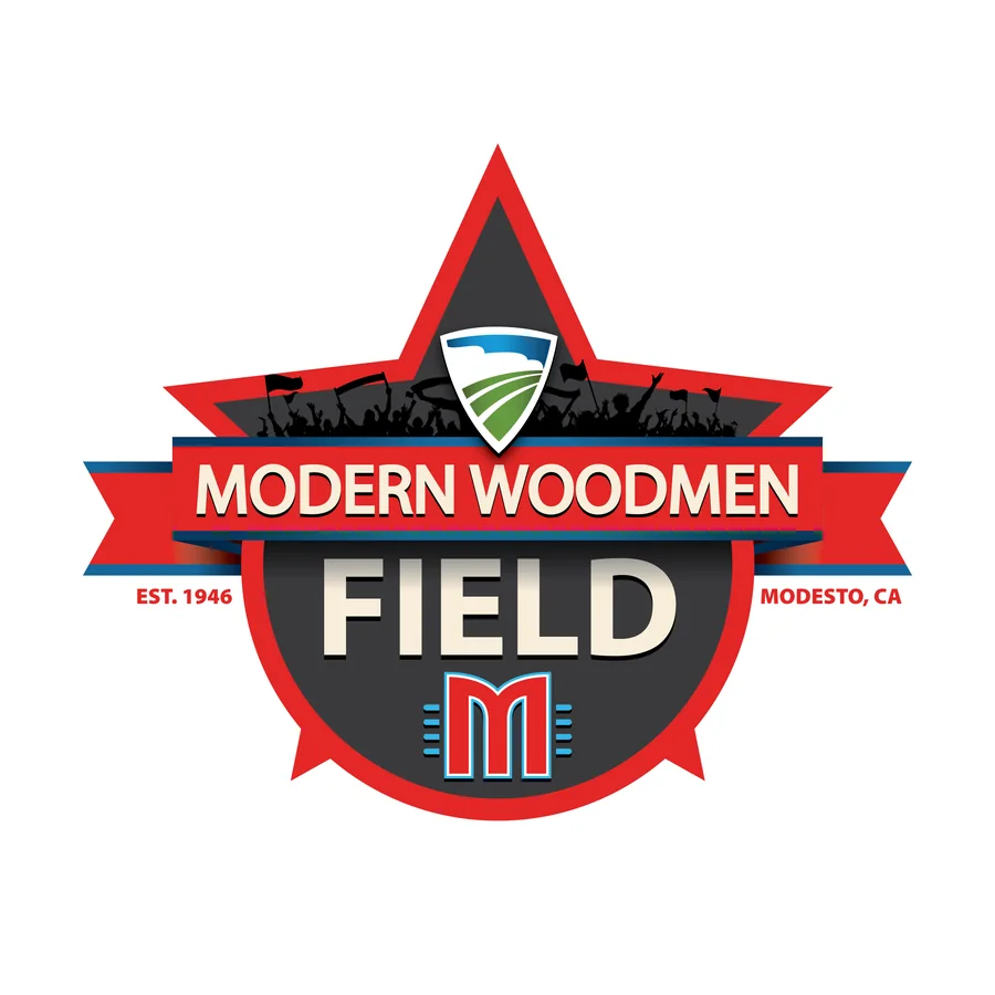
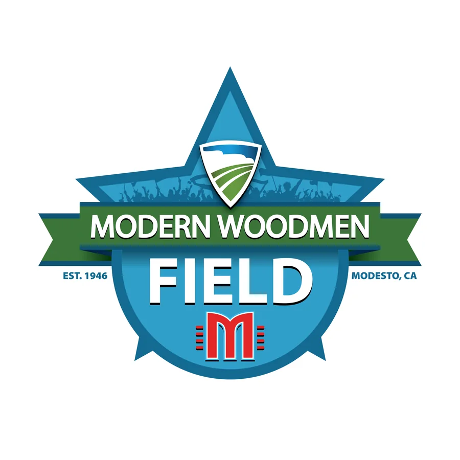
The approved direction was built on a shield. A shield gives you a contained silhouette, enough authority to belong to a venue rather than a team, and a structure that holds a name, a corporate mark and a piece of local imagery without any of them fighting. It also reduces well, which matters more than it sounds like it should.
Inside the shield we put Modesto. Not a generic skyline: the reference set was the Modesto Arch, the Gallo Center for the Arts, Brenden Theatres, the State Theatre, the DoubleTree downtown and the McHenry Mansion. Then we cut it back. Hard.
That simplification was the important part. A detailed cityscape looks impressive in a presentation and falls apart the moment it is illuminated, reduced, fabricated or seen from four hundred feet. We reduced the forms until Modesto was still recognisable and nothing else survived. Modern Woodmen owned the naming rights. The identity belonged to the city.
We worked inside Modern Woodmen's existing corporate system rather than over the top of it, and the rules got written down: Myriad Pro as the supporting typeface with Utopia used sparingly, clear space around the shield equal to about a quarter of its height, and a red treatment of the Modern Woodmen M approved as acceptable. Rules matter here, because the identity was never going to live in one approved artwork file. Fabricators, sponsors, ballpark staff and future vendors all had to be able to use it without slowly wearing it down.
Then make it a hundred feet wide
Approving the logo was the start of the assignment rather than the end of it. A stadium identity that only exists digitally has not really happened. It has to become part of the building.
The approved major naming-rights package covered four kinds of placement.
01
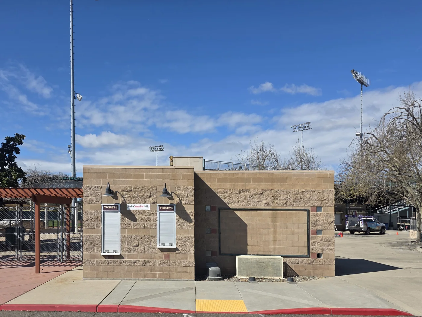
Ticket booths
Two illuminated signs. Entrance signage behaves differently from advertising, because it becomes part of how a guest arrives and orients rather than something they look at.
02
Party Deck arches
Two double-sided illuminated arch signs, which had to work from more than one approach and sit inside a hospitality space rather than simply face the field.
03
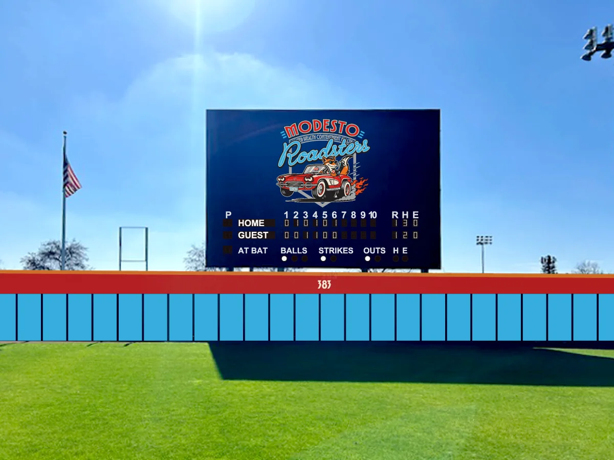
Scoreboard
One of the most visible placements in the park, and the one that quietly repeats itself through every photograph, broadcast frame and sightline for ten years.
04
Batter's eye
The most structurally complicated piece of the project, and the one that stopped being a graphics question early.
Design meets physics
The batter's eye was where the project changed character. The existing structure was found not to be adequate for the sign as proposed, which meant the work moved into structural review, wind-load analysis, engineered support, stamped drawings and municipal permitting.
None of that is our trade. Engineers engineer, fabricators fabricate, the city permits. United Sign Systems handled the drawings, proofs, pricing and fabrication. What we did was stay in it: protecting the design intent while the physical requirements pushed back, and flagging where a structural answer was going to change what the identity looked like.
The commercial scale followed from that. A vendor breakout across the four sign types, then an approved project authorisation larger still, put the signage program well past anything a graphics budget covers. Design decisions had turned into purchasing decisions.
The schedule moved too. The original fabrication expectation was six to eight weeks, and the club was simultaneously rebuilding an entire ballpark for an inaugural season. Opening Day was 19 May 2026. It became unrealistic to assume every major sign would be up before first pitch, so installation was planned in phases across the early home stands instead, and it ran behind even that. Deposit timing, engineering, permitting, stamped drawings, fabrication lead time and sequencing around a live professional facility all contributed.
That is worth saying plainly rather than editing out. A naming-rights identity does not become real because a logo was approved. Large environmental work has dependencies, and most of them are not creative ones.
A brand becomes a place
The Roadsters played their first game at Modern Woodmen Field on 19 May 2026 and won it 12 to 1. The identity did not arrive on its own; it arrived as part of a 75-year-old ballpark becoming the home of a completely new organisation.
That is the difference between sponsor branding and place branding. Modern Woodmen bought the naming rights. The job was to make the building feel like it was actually called that.
The best result was the next phone call
Dave Heller also owns the Quad Cities River Bandits, who play at Modern Woodmen Park in Davenport, Iowa. While the next Modern Woodmen agreement there was being discussed, he said he preferred the Modesto identity to the one that ballpark already had, and asked us to start a conversation about redesigning it.
Modesto assignment, approved venue identity, large-scale implementation, then an invitation to look at another Modern Woodmen ballpark. Work that becomes the reference point for the next job is about the strongest result this kind of project can produce.
What we did and did not do. We designed the Modern Woodmen Field identity and worked on the naming-rights signage program through design, coordination, production review and installation planning. We did not sell or negotiate the naming-rights agreement, engineer the structures, or pull the permits. Signage installation ran behind schedule for several reasons and we are not assigning that to any one party. Final as-built documentation for the completed program is still being assembled.