Work / Brand Identity
The Kingdom’s Forge
A Christian men’s movement that needed strength without hostility. We built the brand out of the theology rather than the aesthetic.
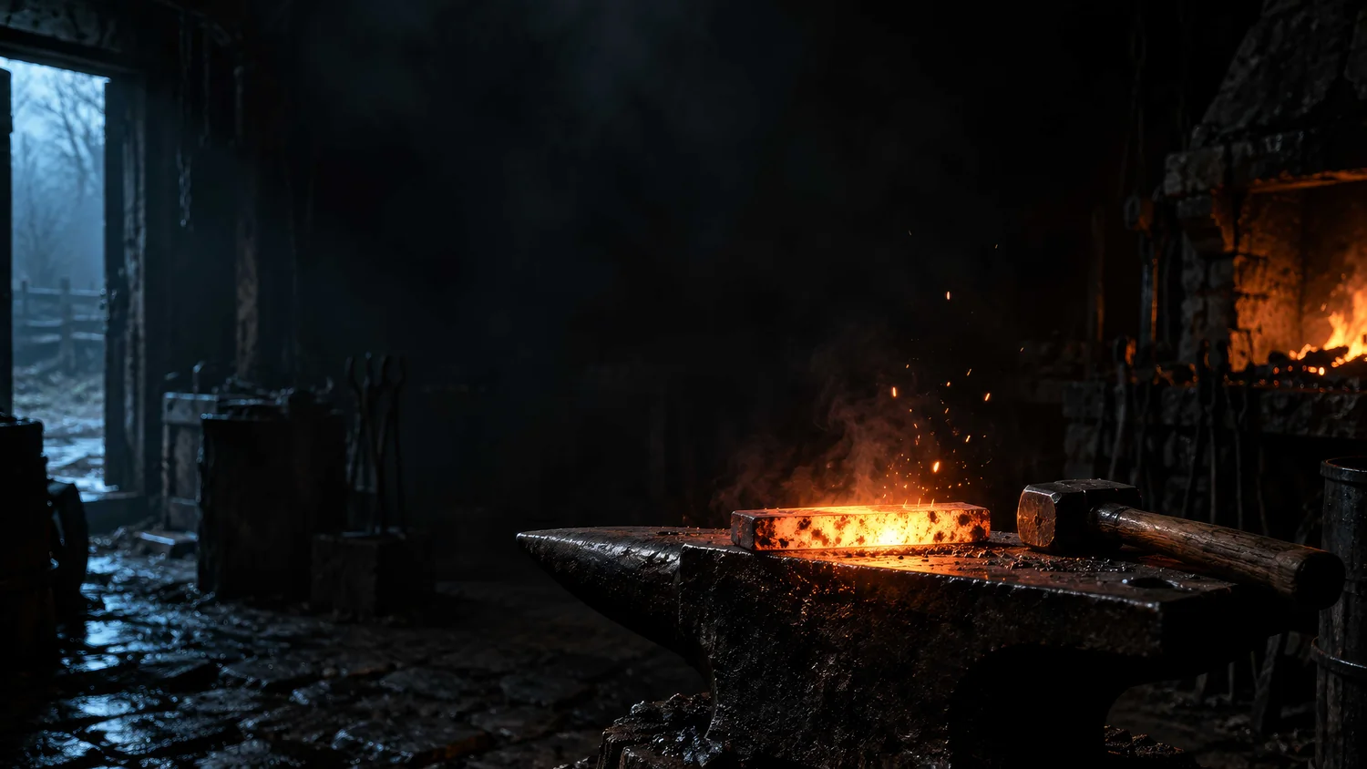
The problem with forges
Michael and Annelise Darling were building a men’s movement around Biblical identity, discipleship, brotherhood and the responsibility men carry at home, in church and in their communities. They came to us for a production-ready logo that could eventually become an illuminated sign.
The category it sits in is full of shortcuts. Fire. Swords. Beards. Mountains. Black shirts. Militarised type. Language about warriors and battles. Any of it reads as masculine in about a second, and all of it flattens a serious ministry into something you have already seen.
The brief that mattered was harder than picking a look. Strength without hostility. Purpose without harshness. Masculinity without ego. Truth without legalism. Brotherhood without softness. The audience included men with settled faith, men whose identity or leadership was coming apart, and men who would not describe themselves as believers at all. The brand had to stand for something and still leave the door open.
Which meant the forge could not be there because forges look tough. It had to mean something.
Theology first, style second
So before drawing anything we worked out what the forge actually represented. That conversation set the whole project.
Fire
Sanctification.
Heat
Trial.
Pressure
Discipline.
The hammer
The Word of God, and the shaping discipline of God.
The anvil
Unchanging Biblical truth.
The metal
The man being formed.
That last one reorganised everything. The man is not the blacksmith hammering himself into something more impressive. He is the material. God is the craftsman. Which rules out the entire self-improvement register that most men’s branding runs on, and gave us a sentence to design against:
Men are not born forged. They are shaped.
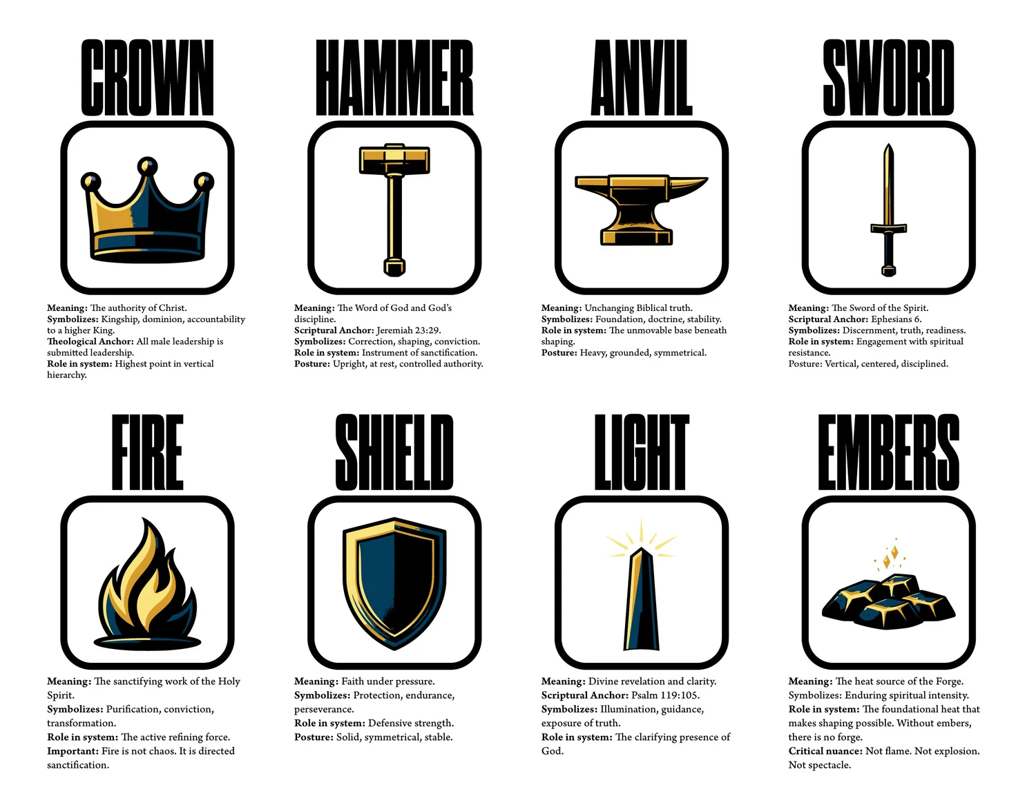
The vocabulary grew from there: crown, hammer, anvil, sword, fire, shield, light, sparks, smoke. Each one was assigned a meaning, a scriptural anchor and a job before anyone drew it. The crown is the authority of Christ. The shield is faith under pressure. The sword is the Sword of the Spirit. Light is revelation. Sparks and smoke are evidence that a process is already underway.
That is the difference between a symbol system and a pile of masculine decoration. When a new programme or content type turns up, there is somewhere for it to come from.
Two postures, not two logos
The primary mark was presented as a strategic choice rather than a beauty contest. Both directions were upright, symmetrical and at rest. No swinging hammer, no exploding sparks, no manufactured aggression.
The first centred on the hammer and anvil with the crown above them, establishing where the authority comes from. It argued for formation over performance, and strength expressed through restraint. The second centred on the Sword of the Spirit and carried a different posture: readiness, resolve, engagement, leadership through clarity.
So the question we put to the client was not which one they liked. It was which posture should introduce The Kingdom’s Forge to the world. That is a different conversation, and a much shorter one.
Building the world
The identity grew into an environment: iron black, smoke grey, molten and royal gold, deep forge blue, ember red, and neutrals in steel and charcoal. Materials to match. Hammered metal, brushed steel, weathered wood, leather, stone, smoke, embers, matte surfaces.
The visual direction is cinematic but deliberately restrained. A hammer resting on an anvil. A scarred shield catching one line of warm light. A glowing piece of steel waiting to be worked. A lamp lighting the lamp beside it. Controlled heat rather than theatrical flame. Lived in and serious, rather than staged.
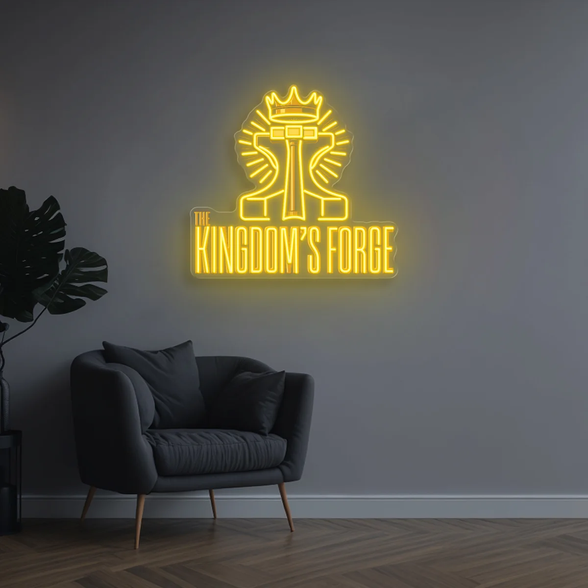
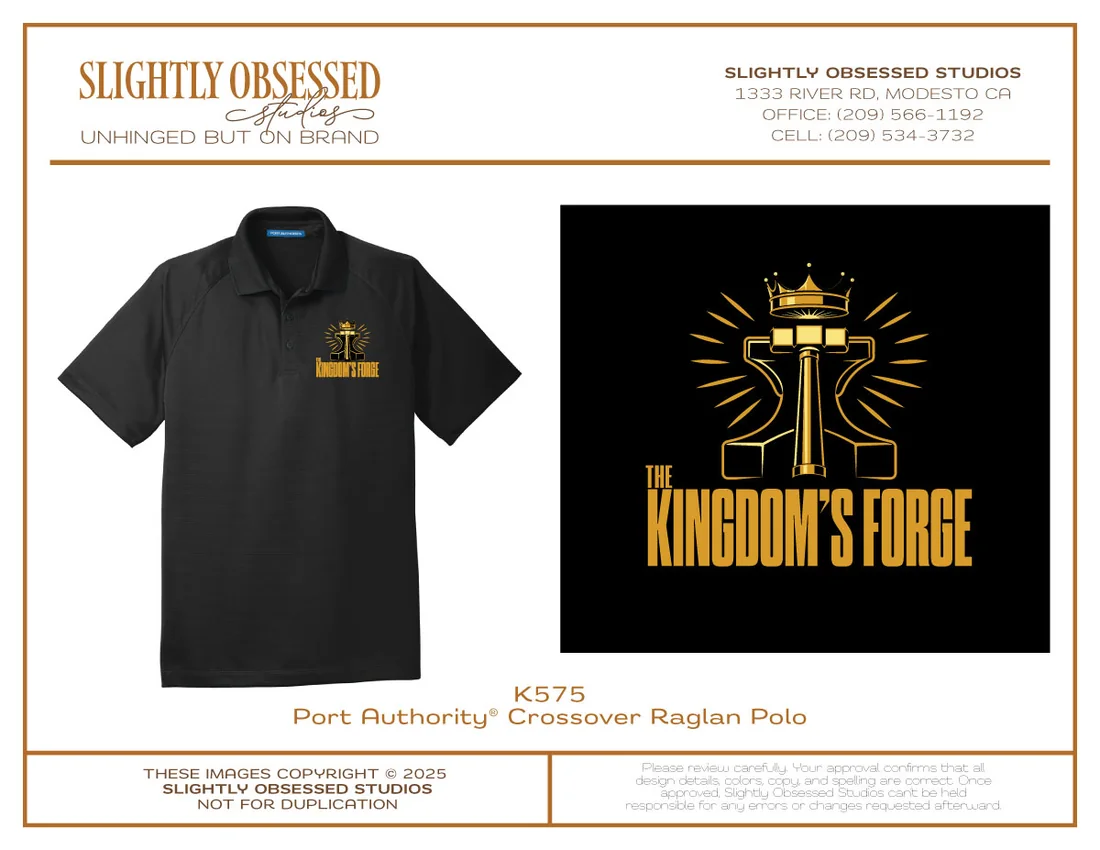
The original ask was a logo that could become an illuminated sign, and that part is real: the mark went out to neon production with tube colours, backing and mounting specified. It has been through embroidery proofs. It is being built into a physical room.
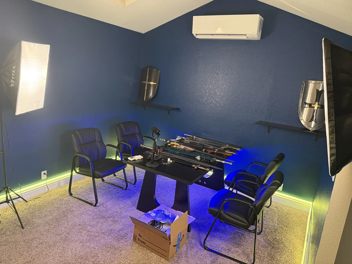
Then the same world, on a screen
The website was treated as another expression of the system rather than a separate design project. It is being built in WordPress, and the demonstration content that came with the framework was stripped out entirely rather than dressed up.
The home page is organised around what the ministry actually does: The Forge for what it is and why it exists, Listen for podcast and audio, Gather for the Monday gatherings in Modesto, and Watch for video. The opening establishes atmosphere immediately through forge imagery, the mark, restrained type, darkness and heat.
Every piece of demonstration photography came off the site. Generic imagery would have undone months of definition in one scroll. In its place is a purpose-built visual library. The imagery is AI-generated, at the client’s direction, and art-directed to the system established during brand development. The real choice was never generated against photographed. It was an owned world against somebody else’s forge pulled out of a stock library. Every frame was briefed, reviewed and selected against the brand rules the same way a shoot would have been.
A teaching section and a four-part marriage series were built and prepared, then pulled back to draft at the client’s request while the wider content direction is decided. Nothing was destroyed. The architecture is there when the ministry is ready for it. We are not trying to fill pages.
Underneath it, the unglamorous half: staging environment, database and backup coverage, controlled staging visibility, SEO configuration, permalink structure, social sharing, migration planning, restore points, and written documentation of the implementation decisions. The point is that the brand should not depend on a website nobody understands in six months.
Where it stands
The biggest result so far is not a logo. It is coherence. The theology informs the metaphor, the metaphor informs the symbols, the symbols inform the identity, the identity informs the imagery, and the imagery informs the site. Each decision has somewhere to come from.
The project started as a request for a production-ready logo. It has become the foundation of a visual and digital world, and it is still being forged.
Status: in progress. The Kingdom’s Forge site is functional in staging and has not launched publicly. Final content decisions, podcast destinations, gathering calls to action and interface refinements remain open, and the launch indexing configuration will be checked at go-live rather than assumed. This page describes the project through September 2026.