Work / Menus & Print
Gold Dust Pizza Express: Menus
A menu is a layout problem and a brand problem at the same time.
The Challenge: Balancing Speed, Clarity, and Branding
Gold Dust Pizza Express needed menus that communicated their focus on speed and convenience without losing the handcrafted charm of the Gold Dust brand. The challenge was to design layouts that were visually appealing, easy to navigate, and reflective of the Express model’s emphasis on quick service, all while aligning with Gold Dust Pizza’s established identity.
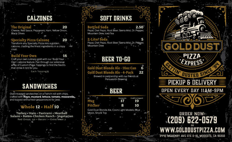
The Obsession Begins: Crafting Menus That Speak
At SOS, we obsess over the details that bring a brand to life. For Gold Dust Pizza Express, the menu wasn’t just a functional tool. It was an extension of the customer experience. From layout to typography, every design choice was made with the customer journey in mind.
The Approach: Designing Menus with Purpose
Our process began with understanding the goals of the Express model: efficiency, simplicity, and a strong connection to the original Gold Dust Pizza brand.
Clear Layout Design
SOS created a structured menu layout that prioritized readability. Items were grouped logically with clear headings and subheadings, making it easy for customers to find what they were looking for.
Brand Integration
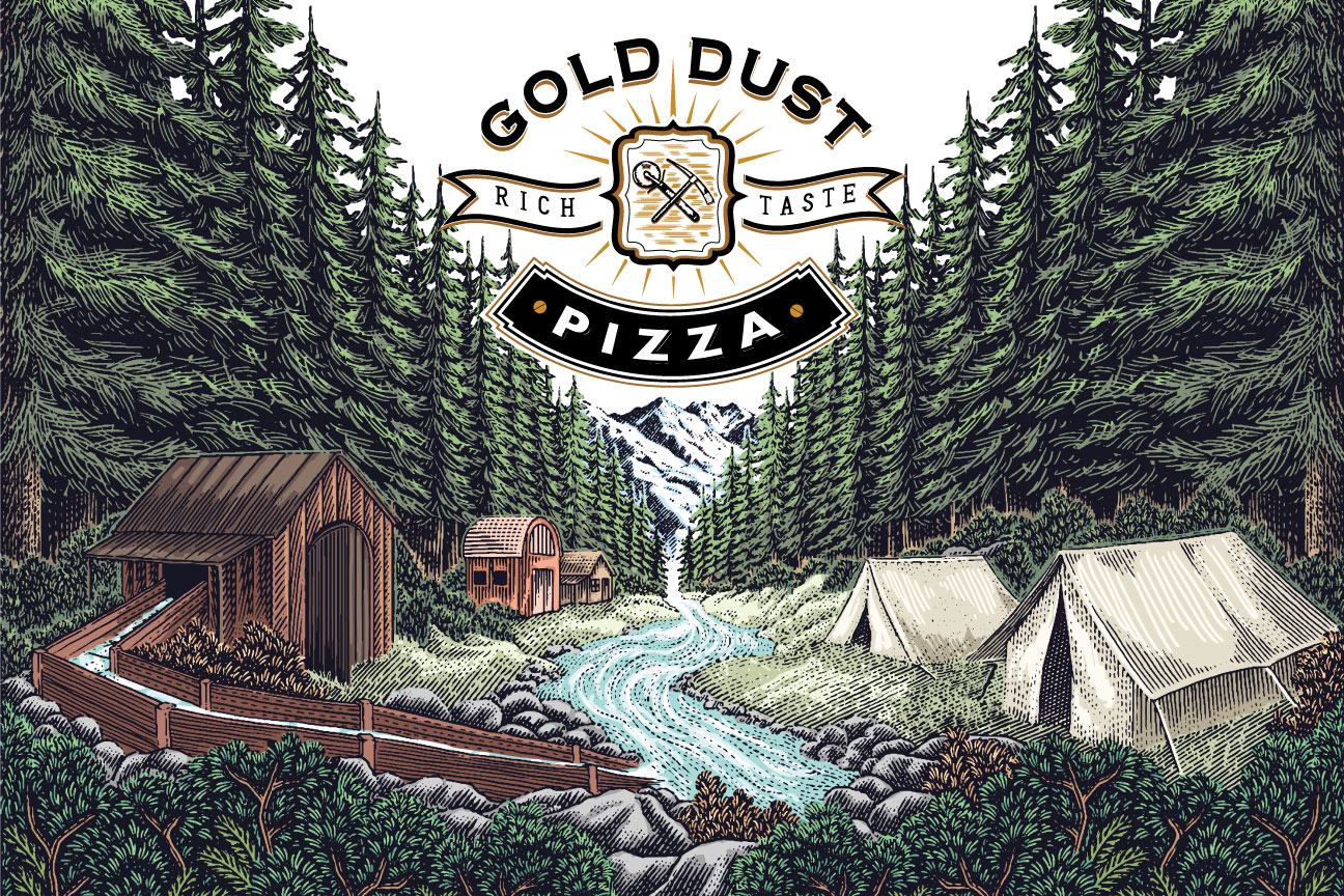
The design incorporated elements like Gold Dust Pizza’s signature colors, fonts, and rustic aesthetic to maintain consistency with the parent brand.
Highlighting Key Items
Popular menu items and customer favorites were given visual prominence to guide decision-making and reduce ordering time.
Durability and Practicality
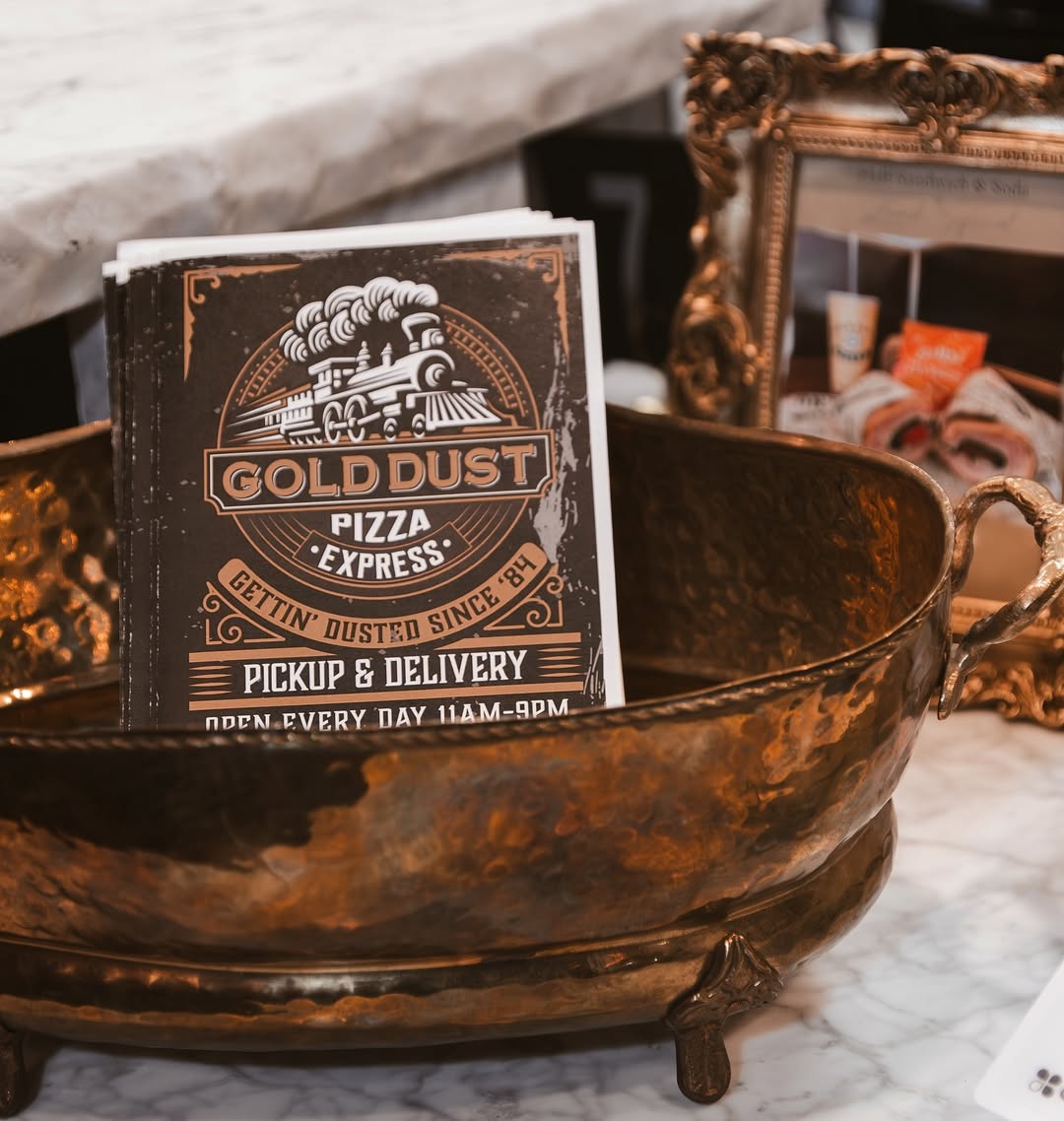
Menus were designed with materials and formats suited to the fast-paced Express environment, ensuring they could withstand frequent use without compromising on appearance.
The Results: Menus Built for a Fast Counter
The Express menus were built for a counter where the line keeps moving, and to read as part of Gold Dust Pizza rather than a separate business.
Built for Speed of Reading
Items are grouped so someone ordering for the first time can find a category without reading the whole board.
Tied to the Parent Brand
The colours, type and rustic detailing carry straight over from Gold Dust Pizza, so the Express model reads as the same company in a faster format.
The First Thing Anyone Reads
At a counter the menu is the first piece of the brand a customer actually reads, so it was designed to carry the brand and not only list prices.
The Takeaway: Menus That Matter
For Gold Dust Pizza Express, the menu design wasn’t just about listing items. It was about creating a seamless, branded experience. At SOS, we understand that every touchpoint matters, and the menu is no exception.
Ready to Redesign Your Menus?
Slightly Obsessed Studios creates menu designs that combine functionality and branding to enhance customer experience. Contact us today, and let’s get obsessed with your next project.
In the press
Dominique Williams wrote: “The beer can label and the Gold Dust Express menu were designed by Modesto artist Greg Gallep.” The paper printed the surname as Gallep. Quoted as published.